


EDITORIAL DESIGN
BRIEF
This was a school assignment, given by our teacher Lisbeth Højmark.
We had to design or re-design a magazine that we ourselves had to choose.
The assignment was a realistic assignment which corresponds 100% to a re-design in real life.
Where agencies redesigned part association magazines, free magazines, food magazines etc regularly.
FAT EQUALS FASHION, ART & TYPE
I chose FAT magazine. A magazine which is published by the Danish agency LOW.
A choice I made in order, to challenge myself, and to show that I have a broad approach to design. The magazine is changed 99% from issue to issue, but in a way, so it has a recognizable look, and that's what people love.
Therefore, it was important to me that I managed to create my own look, which complement the previous issues. I analyzed all the previous releases, and has joined the quest to work as creatively as possible without having to limit myself to rules but at the same time comply with them.
Finally, I like to thank LOW and Søren Hvitfeldt who is behind the original issues of FAT-magazine, for inspiration and guidance on my work with FAT-magazine.
.PREVIOUS ISSUES
Below is a small selection of the style from previous issues.

TYPOGRAPHIC HIERARCHY
Below is my font hierarchy and grid.
I am very playful in style as it is the soul of the FAT magazine.
However, I work respectfully with both grid and typography.
However, I work respectfully with both grid and typography.

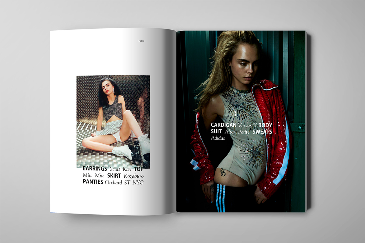
FINAL DESIGN
Below can be seen the final design of my FAT-magazine.


GRID AND USAGE
Below can be seen examples of how I use my grid.
I have worked with a 10 split image grid and a 4 split text grid.
I have worked with a 10 split image grid and a 4 split text grid.


